Optiv — Brand Concept Proposal
Making complex technology feel clear and approachable.
- Optiv (Concept Proposal)
- Information Technology
- Independent Designer
- 2 weeks
- Brand Strategy · Identity Design · Digital Applications
Optiv is a brand concept proposal developed as a pitch for a prospective technology client. The system explores how an identity can feel structured and recognizable across digital and physical formats.
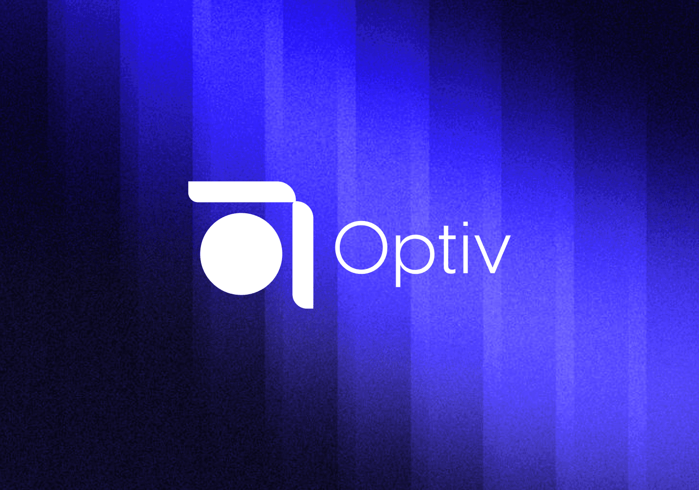
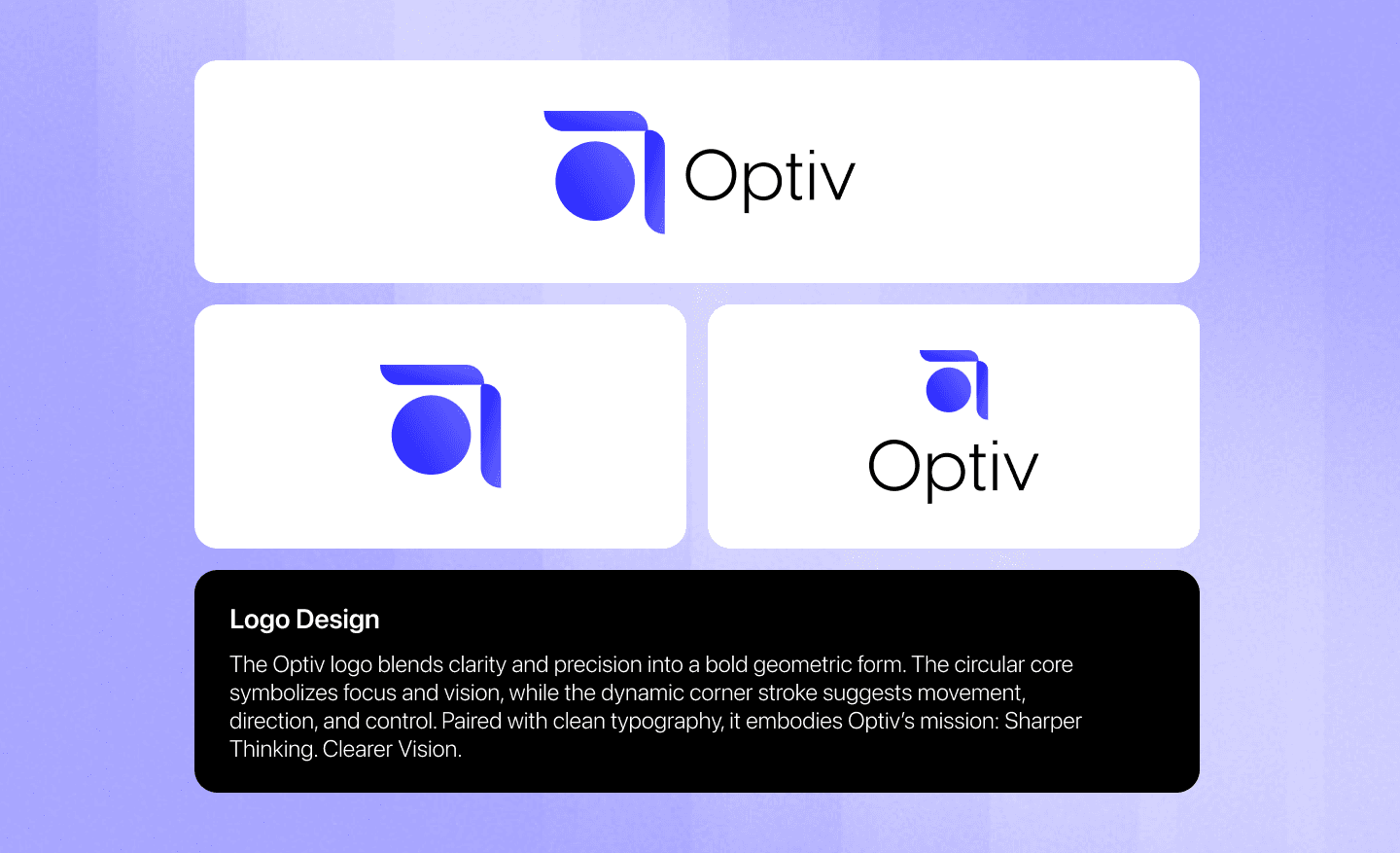
Technology branding can easily become overly busy with complex patterns. The concept pitches a simple geometric monogram built on a grid, showing how the system scales down to small avatars and up to exhibition posters.
As Independent Designer, I created the brand strategy, visual monogram, layout grids, colors, iconography, and multi-device application mockups for the pitch proposal.
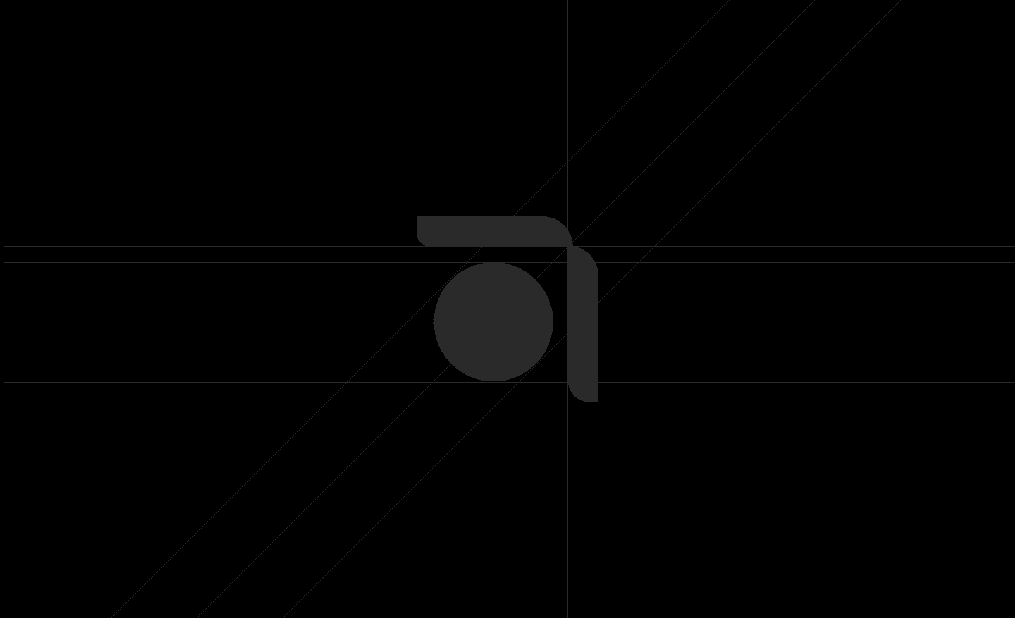
Grid-aligned monogram construction
The core mark was built on a precise geometric grid. This structure ensures readability at small scales and consistency across print and digital formats.
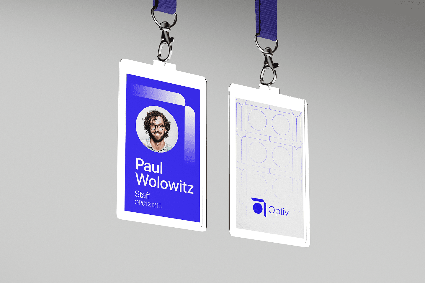


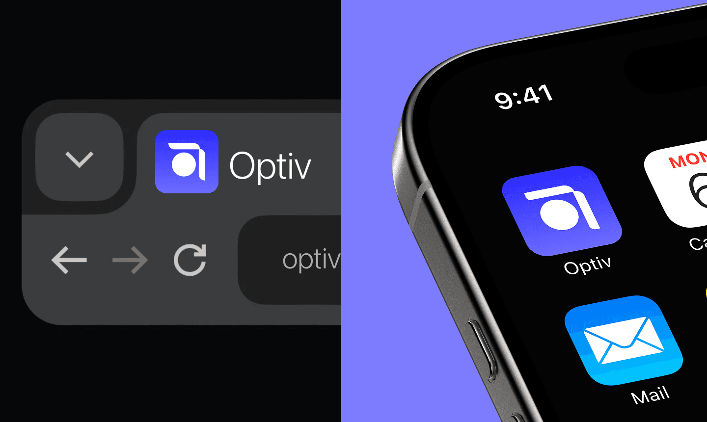

Cross-channel brand logic
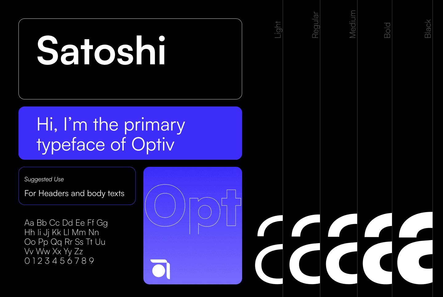
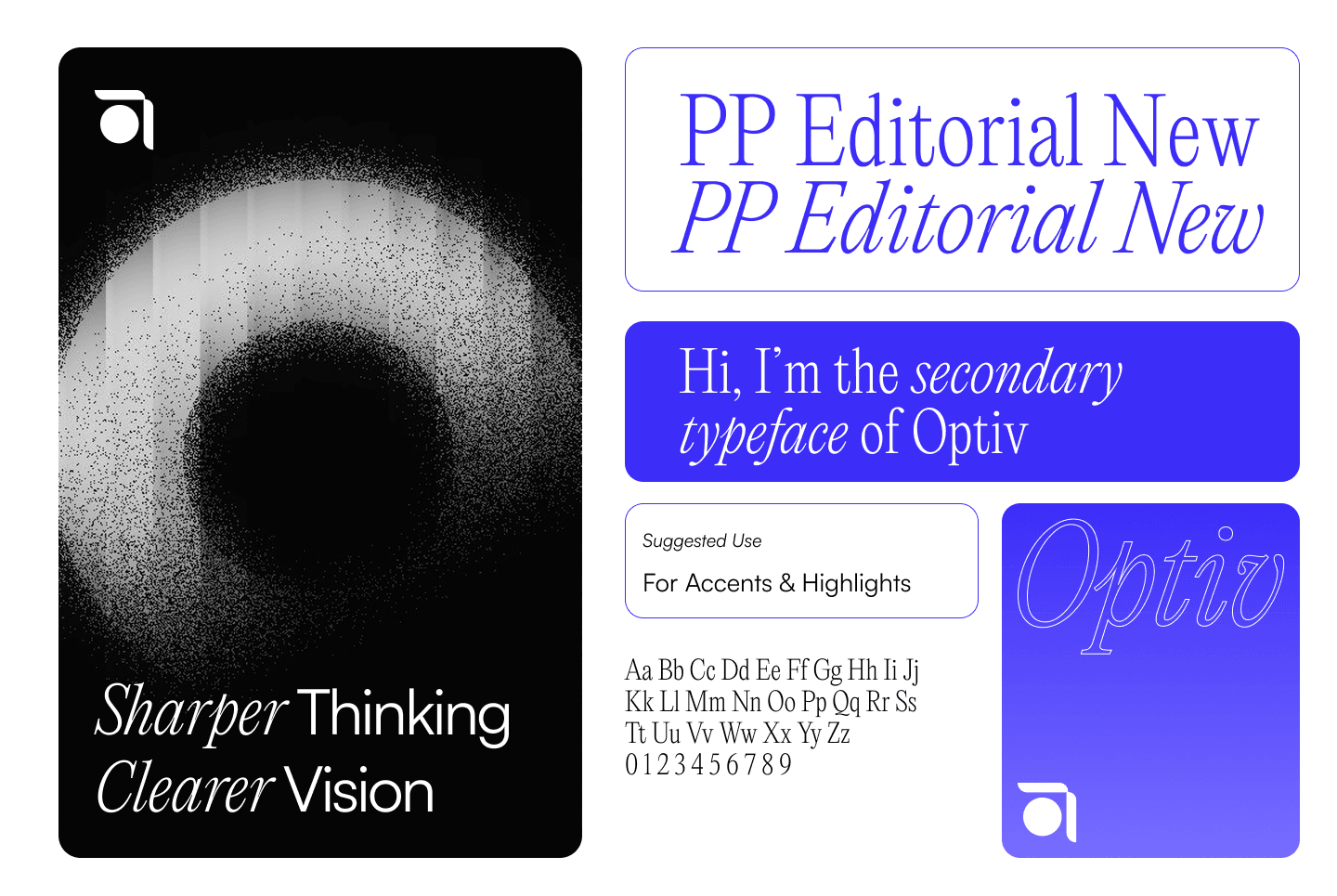
We established consistent rules for layout, colors, and type pairing. This system ensures the brand voice remains clear on business cards, packages, and interfaces.




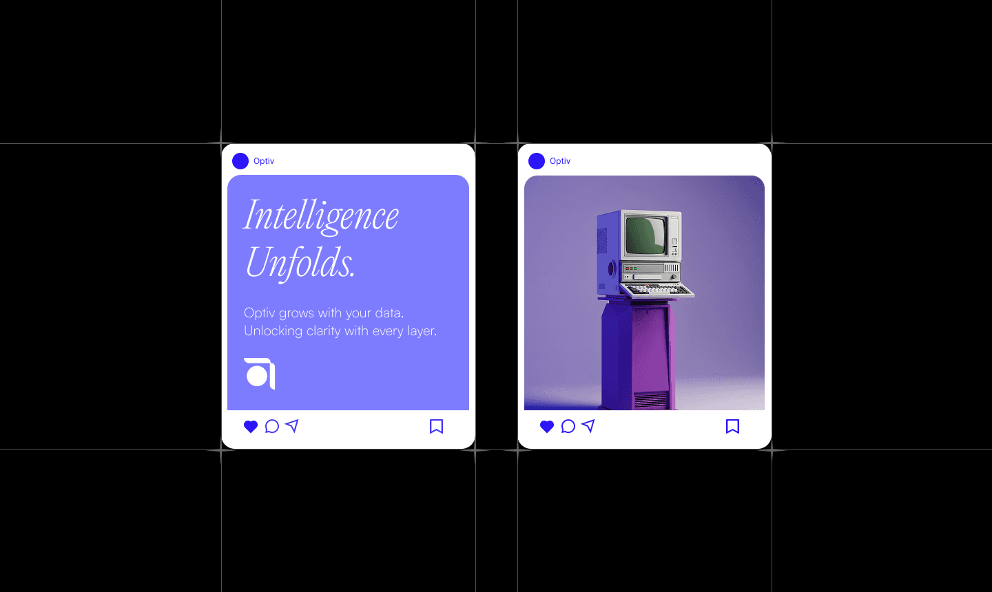
Interactive digital proposal details
We designed portal layouts, dashboard states, and mobile grids. These concepts show how the identity functions in responsive software, not just static mockups.

The project was developed as a concept proposal for prospective client evaluation. It showcases a scalable, grid-aligned identity design system designed for modern multi-device applications.